Using Components
A component is an instance of predefined content. Sites usually have several component types; often these component types are specific to the site design. In general, a component is a piece of content that is:
- Always viewed in the context of another page.
- Used in multiple places across the site.
You can add a component to a page by dragging and dropping the component from the site tree into a component element on a page. Alternately, you can pick a component from the Select a Component dialog. In CMS 9.0, you can also create components in the context of an individual page.
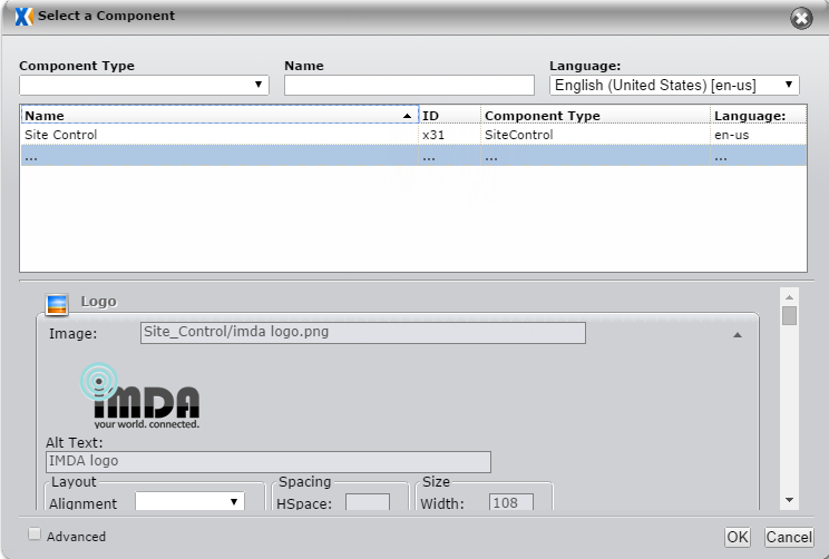
The Select a Component dialog provides several options for finding components.
|
Option |
Description |
|---|---|
|
Component Type Filter |
Located in the upper left, this drop-down list displays all component types. Selecting a single type restricts the component list to only those of the selected component type. |
|
Component Name Filter |
Located in the upper right, this text box restricts the component list to only those whose names contain the typed text. |
|
Component List |
Located in the middle of the page, this list shows potential components. If you type a letter while the list is selected, the list will jump to components whose names begin with the typed letter. |
The preview area in the lower half of the Select a Component dialog displays the selected component's content. This makes it easier to verify that the component selected is the one you want.
To use a component on a page:
- Locate a component element in the edit form.
- Click Pick. The Select a Component dialog box appears.
- Filter for the desired component, if necessary.
- Preview the values for the selected component.
- Click Select.
If a component element is no longer needed on a page, you can use the Clear button to remove any component data from the element.
A Note on Image Components
The user interface for the Image Component schema includes the Image Editor within the edit form. Image properties appear in a right side bar. Clicking the image or the Browse button will bring up the Image Selection dialog.
A thumbnail-size image can be created directly from the UI. Default dimensions are 100 x 75 pixels, but this can be changed. This dialog creates an asset in the Images directory.