Creating Forms in Page Builder
Visual Form Builder is a built-in set of content units that make it easy to create forms. Previously a separately installed application module, the files and code now come preconfigured for creating forms in Page Builder.
This article details how to build a form using the Visual Form Builder templates in Page Builder. For information on processing form data, refer to Processing Form Data for details to create a processor page.
Setting Up a Page Builder Template
Before creating a form, there must be a Page Builder template that will contain it. (For more detailed information on using Page Builder, refer to the Page Builder documentation.)
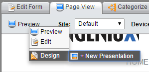
Navigate to the page where the form will be contained. Make sure the page is checked out, and then select Preview > Design > New Presentation.
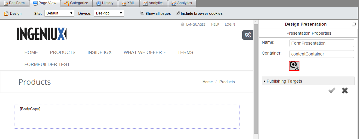
Enter a name for the presentation and click the target icon. Then select a container on the page and click the check mark.
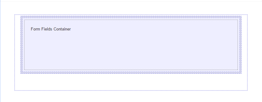
On the Layout tab, drag a layout unit to the blank container. The examples in this article use the single-column layout.
Then click Content Units tab. Locate the Visual Form Builder - Form content unit and drag it to the layout. This is the content unit that contains the rest of the Forms Builder components. A dialog appears with configuration options. These first three fields are required:
- Name: The form's name.
- Method: The HTTP method (either GET or POST) by which the form submits data.
- Action URL: The URL of the page that processes form data. This is usually an internal page written in a server-side language like PHP or ASP.
There's also a set of advanced options:
- target: The HTML attribute that determines where to display the form.
- AJAX Request: When enabled, the form submits through AJAX. Because the page's URL doesn't change, the value of the target field has no effect.
- Hidden Fields: A component picker for selecting Visual Form Builder - Form Field - Hidden component content units.
- Form Class: A custom CSS class can be added here.
- Form Description: A short description of the form for internal use.
After completing the content unit, click Apply Changes. The form content unit appears on the page.
The final step before building out the form itself is to add layout units within the form content unit. Click the content unit so that the Content Unit properties section appears in the Page Builder pane.
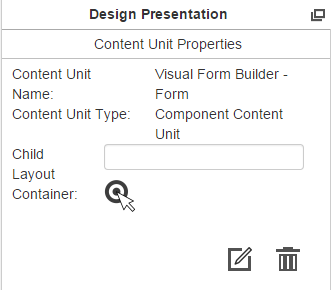
Click the target icon, then click the content unit again. On the Layout tab, select a layout unit and drag it to the content unit. Now you can add Visual Form Builder content units and begin building a form.
Configuring Form Field Content Units
Excluding the top-level Form content unit, there are six form field content units for creating forms.
- Button
- Captcha
- Checkbox
- Label
- Selection
- Text
To add a Visual Form Builder content unit, drag it from the Content Units tab to the layout. This section explains the configuration options for each content unit.
Visual Form Builder - Form Field - Button
A button used to either submit or reset a form.
Field Name: The button's name.
Button Type: Select whether the button resets the form or submits its information.
Button Label: The name that appears on the button.
Visual Form Builder - Form Field - Captcha
A field for a Captcha. Requires a reCAPTCHA account.
Captcha Key: A global key for the site's domain, generated by a reCAPTCHA account.
Recaptcha Id: The reCAPTCHA widget's ID.
Visual Form Builder - Form Field - Checkbox
A check box.
Field Name: The name of the check box.
Checkbox label: The label that appears in the UI for the check box.
Checked by Default: When enabled, the check box is checked by default.
Visual Form Builder - Form Field - Label
A simple field label. No configuration options exist; to complete the label, just enter text.
Visual Form Builder - Form Field - Selection
A tool for users to select from a predefined list of options.
Field Name: The name of the selection tool.
Selection Input Type: The type of selector. There are three options:
- Select: The user selects one option from a drop-down menu.
- Radio: The user selects one option from radio buttons.
- Multi-select: The user can select multiple options from a menu.
Field Value: The value of the field.
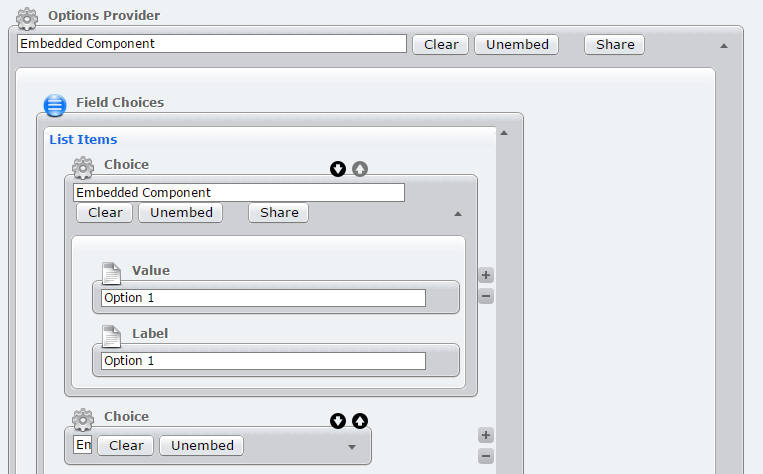
To populate the selection tool, open the Advanced section. Options are added as a list of embedded components.
Visual Form Builder - Form Field - Text
A text field in which users can enter input.
Field Name: The name of the text field.
Text Input Type: The type of text field. There are three options:
- text: A simple text field, suitable for shorter input.
- textarea: A larger text field.
- password: A password field.
Field Value:
Advanced Form Field Options
Each form field component content unit has an Advanced section. There are two primary options that can be configured: CSS class and validation.
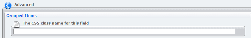
The CSS class field allows for the insertion of a custom CSS class to style the form field.
On the Validation field, you can insert components that validate user input. Find out more in this article about form validation components.