CMS 10.0–10.5 Form Field Content Units
Prerequisites:
- Administrators: Complete prerequisites to enable user access to the Design tab. See Page Builder Prerequisites for details.
- The following topic assumes that a visual form template exists in the presentation container. See Configuring Form Templates for details.
To add a Visual Form Builder content unit, drag it from the Content Units area of the Design Presentations pane to your chosen layout. For details about selecting content units, see Adding Child Layouts to Forms.
Visual Form Builder Form Fields
Excluding the top-level form content unit, there are six form field content units for creating forms.
Visual Form Builder - Form Field - Button (Component Unit)
A button used to either submit or reset a form.
Field Name: The button's name.
Field Name: The button's name.
Button Type: Select whether or not the button resets the form or submits its information.
Button Label: The name that displays on the button to users.
Visual Form Builder - Form Field - Captcha (Component Unit)
A field for a CAPTCHA. Requires a reCAPTCHA account.
Captcha Key: A global key for the site's domain, generated by a reCAPTCHA account.
Recaptcha Id: The reCAPTCHA widget's ID.
Visual Form Builder - Form Field - Checkbox (Component Unit)
A checkbox used to select or clear an option.
Field Name: The name of the checkbox.
Checkbox Label (optional): The label that displays in the UI for the checkbox.
Checked by Default (optional): When enabled, the check box is checked by default.
Visual Form Builder - Form Field - Label (Field Unit)
A simple field label. No configuration options exist. To complete the label, just enter text.
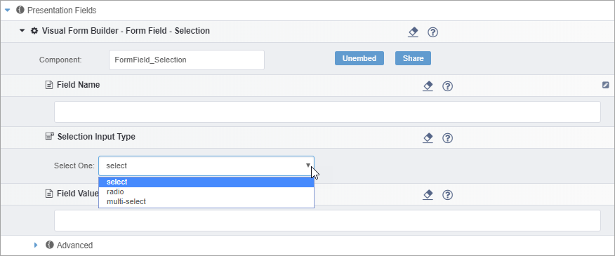
Visual Form Builder - Form Field - Selection (Component Unit)
A tool for users to select from a predefined list of options.

Field Name: The name of the selection tool.
Selection Input Type: The type of selector. There are three options:
- Select: The user selects one option from a drop-down menu.
- Radio: The user selects one option from radio buttons.
- Multi-select: The user can select multiple options from a menu.
Field Value (optional): The text value of the field.
Visual Form Builder - Form Field - Text (Component Unit)
A text field in which users can enter input.
Field Name: The name of the text field.
Text Input Type: The type of text field. There are three options:
- text: A simple text field suitable for shorter input.
- textarea: A larger text field.
- password: A password field.
Advanced Form Field Options
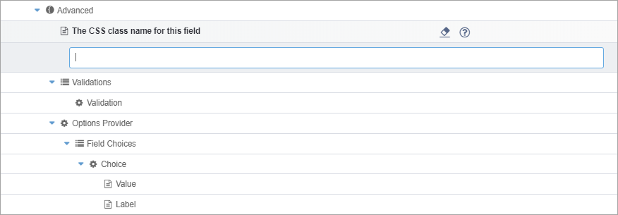
Each form field component content unit has an Advanced section (except for Captcha). In the Advanced area, you can configure two options:
- CSS Class Required for custom CSS. The CSS class field allows for
the insertion of a custom CSS class to style the form field.

- Validation
Required for user input validation. In the Validation field, you can insert components that validate user input. See Validating User Input for details.
NoteYou can only configure the Validation option for the following form fields:- Visual Form Builder - Form Field - Checkbox
- Visual Form Builder - Form Field - Selection
- Visual Form Builder - Form Field - Text
