Creating New Page Layouts with Page Builder
Ingeniux Page Builder offers CMS administrators and power users a simple way to build and edit page layouts. It does this through an intuitive graphical interface, requiring no knowledge of web-development techniques. Users can change the structure of individual pages and create new layouts in a visual way, all without sacrificing the utility of reusable, highly structured CMS content.
The Presentation Layer
Central to Page Builder is the concept of the presentation layer. The CMS content-rendering model separates page data (structured XML) from page templates (XSLT of MVC views). This divide between data and presentation, a standard practice in web development, allows for content that can be used in many ways and in many places.
The presentation layer is an intermediary between content and layout. It gives users the flexibility to define the appearance of a page while simultaneously structuring its content. It does this, however, using a grid-based layout that's modeled closely after the Ingeniux CMS content-blocking process. This means that users can reuse existing structured content (for example, components or BodyCopy elements) in addition to creating new content elements to create the page layout they desire.
Layout Units and Content Units
There are two pieces to a Page Builder presentation: layout units and content units.
Layout units are predesigned containers that act as building blocks for creating presentation page designs. These units don't contain content. Instead, they are placeholders for content.
Content units define specific HTML rendering for specific fields on a page. These fields could be a field schema or a standard field that is dropped into a layout.
Note: See Creating Content Units with Child Layouts for details to drop content units into child layouts.
Building New Page Layout
To access the Page Builder user interface, navigate to the page whose layout you want to edit. Ensure that the page is checked out (if it isn't, click Check Out) and then click the Page View tab. Select Preview > Design > New Presentation to open Page Builder.

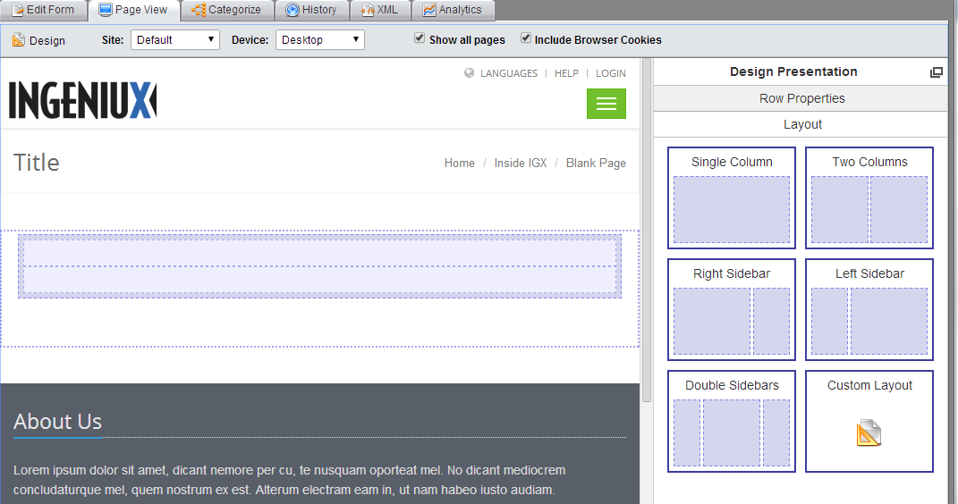
The Design Presentation pane opens as a sidebar. (It floats on the page if you click the Undock button in the upper-righthand corner.) It contains three tabs: Presentation Properties, Layout, and Content Units.
Setting Presentation Properties
Before configuring layout and content units, you must select the container in which they will be placed. On the Design Presentation tab, enter a name for the presentation and click the target icon.
![]()
Then, on the page generated in the Page View tab, click the area where you want to edit the layout. The container is outlined on the page, and the container's ID populates the Container field.

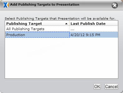
In the Publishing Targets field, All Publishing Targets is the default option. To specify a different publishing target, click the plus button and select the desired target from the dialog that appears and click OK.

When you're finished, click the check mark icon to commit your changes.
![]()
Configuring Layout
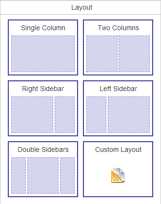
The Layout tab contains a selection of page layouts organized by columns and sidebars. (These layouts contain no content; content is provided by content units.)

To apply a layout to a page, click the layout you want to use and drag and drop it to the container area you selected. The layout now appears on the page.
Note: To remove a layout from a page, click it on the page and drag and drop it to the Layout pane.

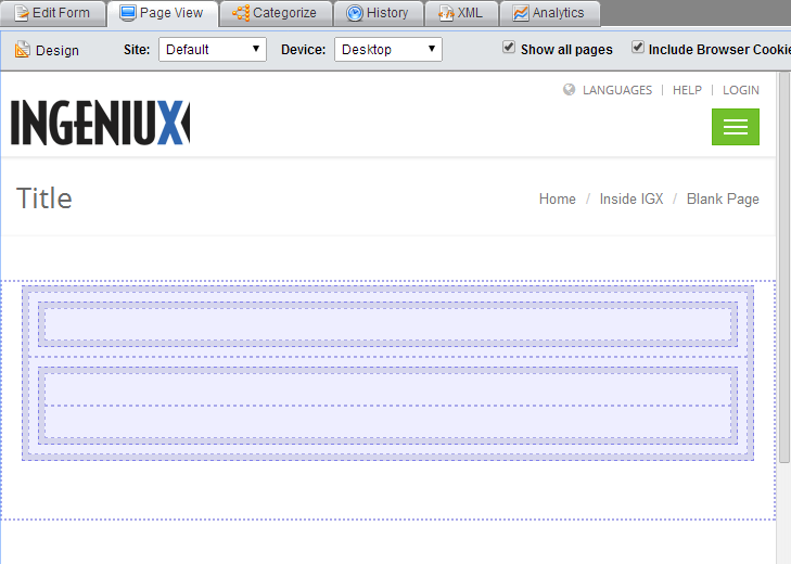
You can also nest page layouts. Below, a single column and right sidebar have been added to the two-column layout from the previous screenshot.

Clicking an individual content unit brings up its properties. On this section, you can add padding to the top, right, bottom, and left of the layout unit and provide it with Additional Class Names. The properties section for columns also contains plus and minus buttons for adding and deleting columns.
