Design Tab
Prerequisites: Administrators, complete prerequisites to enable user access to the Design tab. See Page Builder Prerequisites for details.
Users can access the Design tab to use Page Builder. The CMS Page Builder feature provides users with tools to visually design page presentations with layouts and presentation content units.
The Design tab functionality and user interface differs depending on your CMS site version. Follow the section that corresponds with your version.
CMS 10.6
CMS 10.6 Design Tab Toolbar
The Design tab toolbar has the same functionality as the Preview toolbar, with the addition of the Zoom preview when resize checkbox.

Selecting the Zoom preview when resize checkbox decreases the preview size of the surrounding content in the Design tab workspace. In other words, the option zooms out of the Page Builder view to display all content (i.e, full screen). If selected, the checkbox maintains its responsive mobile view.
CMS 10.6 Design Tab Workspace
The Design tab workspace previews the page view and displays the location of available containers for presentations. After presentation creation, the workspace displays the location of layouts and content units that reside within the presentation.
CMS 10.6 Containers Accordion Menu Option
The accordion menu contains two options: Containers and Design. Use the Containers accordion menu option to choose a container for the design presentation.
<div> element within the page. The
@id value associated with the <div> element
identifies the container, and the @id displays as the container name in the
list.CMS 10.6 Design Accordion Menu Option
Use the Design accordion menu option area to add row layouts and presentation content units to the design presentation.
CMS 10.6 Row Layouts
Use the Row Layouts section to add prebuilt or custom layouts to the selected container. Layouts use grid rows and columns to structure content units inside the presentation container.

CMS 10.6 Content Units
Use the Content section to add presentation field or component units to selected layouts.
Each column within a layout row can contain one content unit.

CMS 10.6 Create a Page Builder Presentation
See CMS 10.6 Building Page Builder Presentations for details.
CMS 10.0–10.5
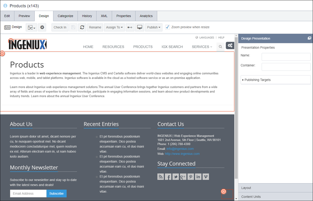
CMS 10.0–10.5 Design Tab Toolbar
The Design toolbar has the same functionality as the Preview toolbar, with the addition of the Design button and the Zoom preview when resize checkbox.

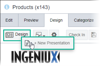
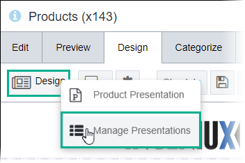
The Design button provides the option to create a presentation or the interface to manage (i.e., delete) the presentation in the page. See Deleting Presentations for details.
If no saved presentation exists in the page, the New Presentation option displays.
If a saved presentation exists in the page, the Manage Presentations option displays.
Selecting the Zoom preview when resize checkbox decreases the preview size of the surrounding content in the Design tab workspace. In other words, the option zooms out of the Page Builder view to display all content (i.e., full screen). If selected, the checkbox maintains its responsive mobile view.
CMS 10.0–10.5 Design Tab Workspace
The Design tab workspace previews the page view and displays the location of available containers for presentations. After presentation creation, the workspace displays the location of layouts and content units that reside within the presentation.
CMS 10.0–10.5 Design Presentation Accordion Pane
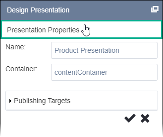
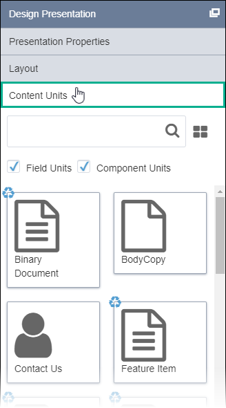
The Design Presentation pane contains an accordion menu with three initial areas: Presentation Properties , Layout , and Content Units. By default, the pane docks to the Design tab workspace on the right. Choose whether to float (undock) or hide (minimize) the pane in the workspace.
CMS 10.0–10.5 Presentation Properties Accordion Menu Option
Use the Presentation Properties area to choose a container and assign publishing targets for the design presentation.

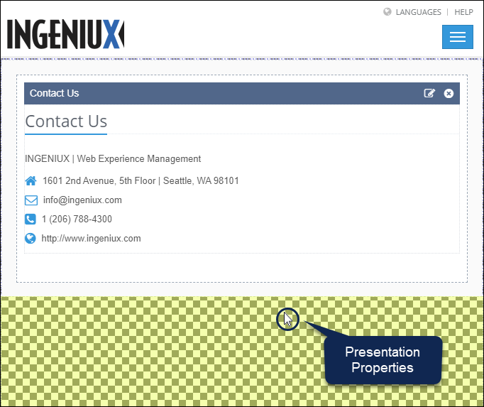
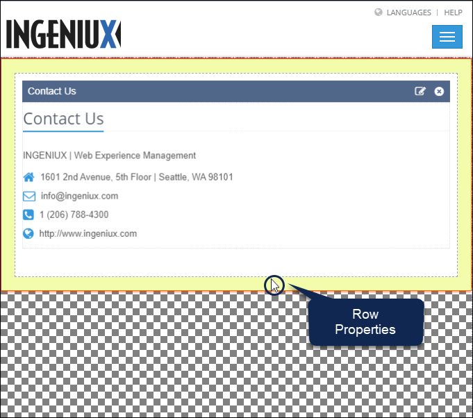
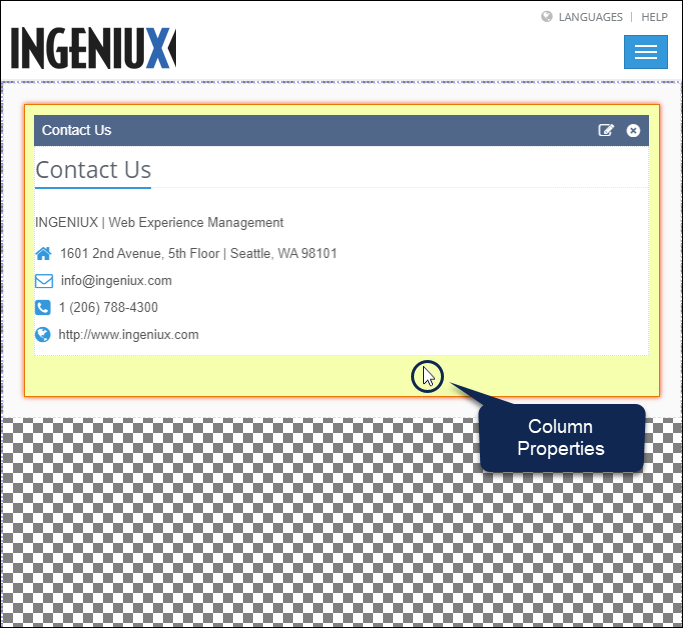
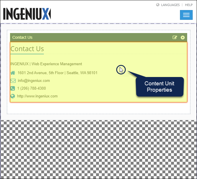
Depending on what the user selects in the workspace, properties display for the different Page Builder presentation objects. Row Properties, Column Properties, and Content Unit Properties are available after adding layouts and content units to the page presentation. The following properties are available:
| Properties Area | Presentation Object | Description | How to Access |
|---|---|---|---|
| Presentation Properties | Containers | Properties for your presentation. Use this area to select a container, name the presentation, and assign publishing targets to the presentation. | Select the checkered background (i.e., area where no layouts are placed) in the
container.
|
| Row Properties | Layouts | Use these properties in conjunction with the Design Presentation pane's Layout area. Row Properties control the layout object row's padding, additional class names, and the number of available columns. | Select the outermost area (gray) inside the layout.
|
| Column Properties | Layouts | Use these properties in conjunction with the Design Presentation pane's Layout area. Each column in the layout object's row has their own respective column properties. Column properties control each column's width, padding, and additional class names. | Select the middle area (white) inside the layout. Don't select the content unit
itself.
|
| Content Unit Properties | Content Units | Use these properties in conjunction with the Design Presentation pane's Content Units area. Content Unit Properties displays the content unit's name and type, options to edit or delete the content unit, and options for child layouts. | Select the content unit header or the content area itself.
|
CMS 10.0–10.5 Layout Accordion Menu Option
Use the Layout area to add pre-built or custom layouts to the selected container. Layouts use grid rows and columns to structure content units inside the presentation container.
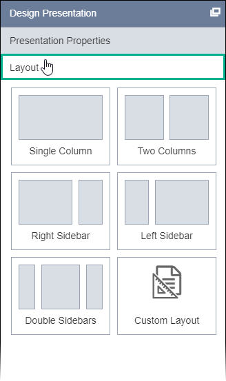
See the Properties table above for details to modify layouts.
CMS 10.0–10.5 Content Units Accordion Menu Option
Use the Content Units area to add field or component units to selected layouts.
Each column within a layout row can contain one content unit. See the Properties table above for details to modify content units.
CMS 10.0–10.5 Create a Page Builder Presentation
See CMS 10.0–10.5 Building Presentations for details.

