Color Theme Reference


The Themes tool provides fields to change colors within individual themes. Each field in the theme editor has a label (e.g., P1, T3, A2), and each field color value corresponds with different objects in the CMS user interface.

Color Fields

Use this reference to identify which color fields affect the different objects in the CMS UI. Use the primary table below to navigate to details about each Themes color field.

P (Program)T (Text)A (Accent) D (Dashboard)I (ICE)
Note
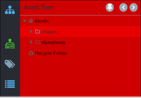
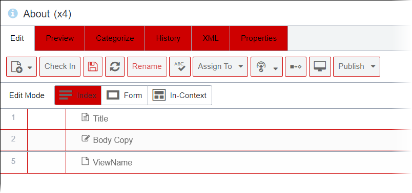
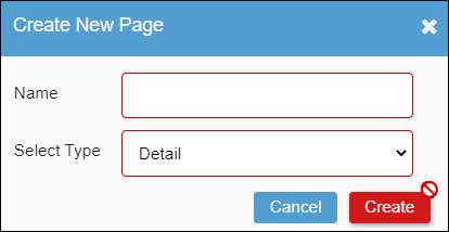
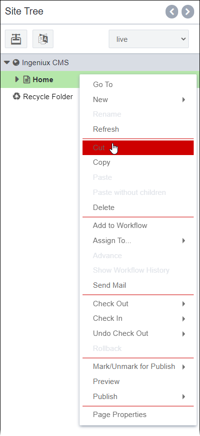
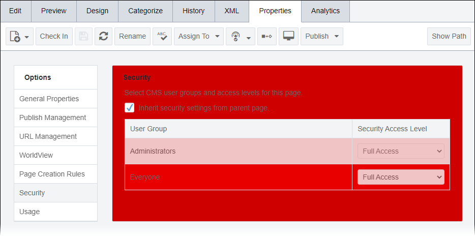
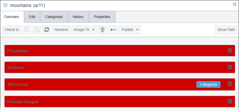
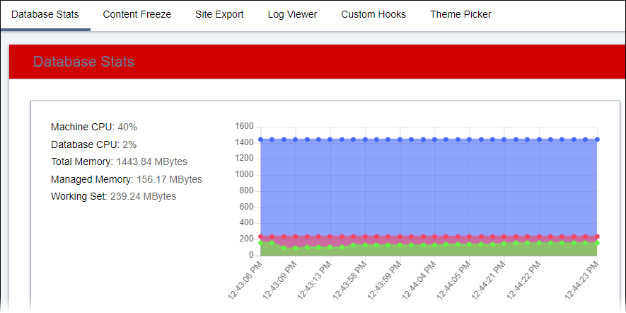
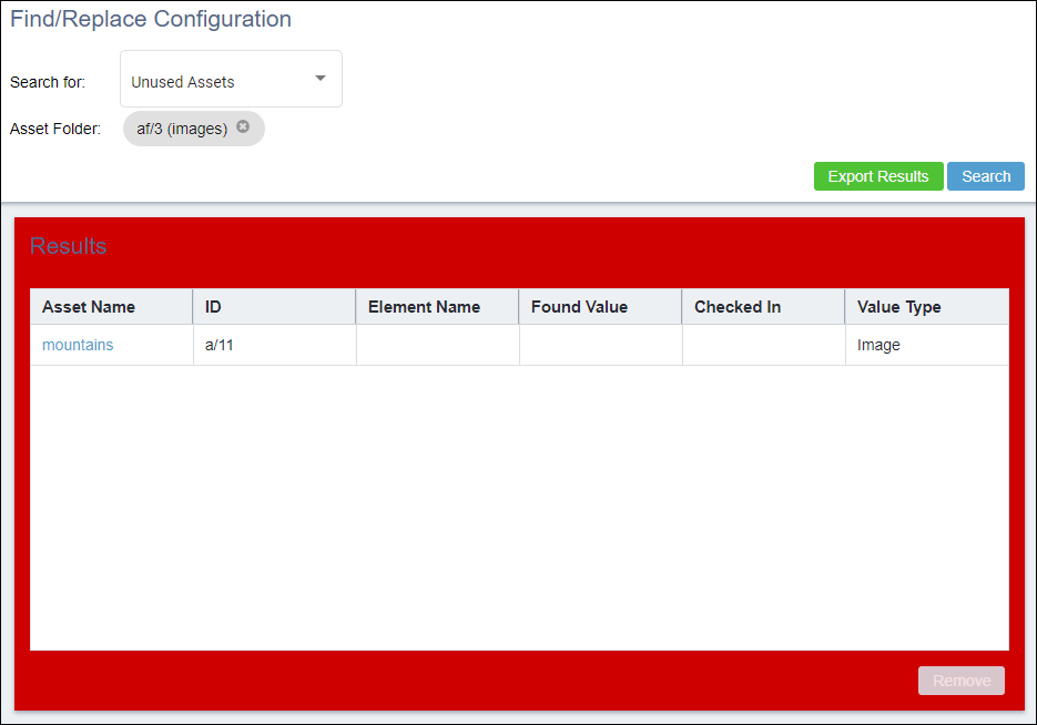
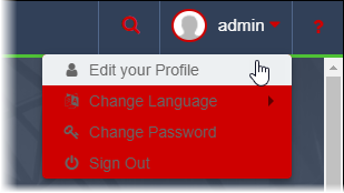
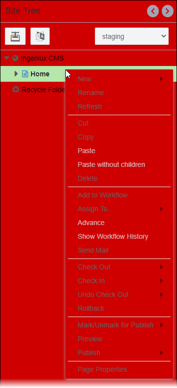
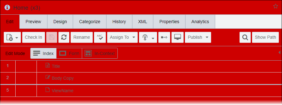
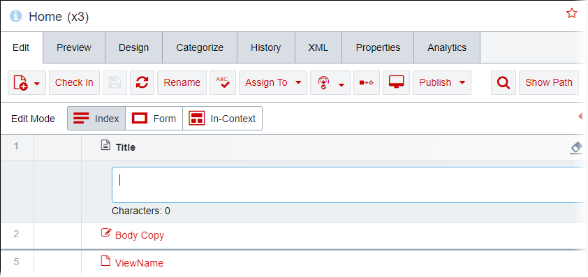
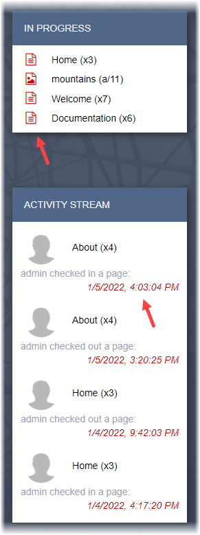
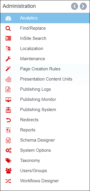
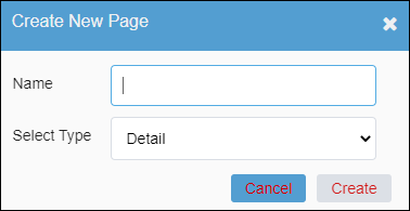
In the section tables below, the UI Object column indicates the CMS UI objects that correlate with a color field value in themes. For demonstration purposes, the images in the Example column display UI objects where, based on the theme's correlating field value, the standard Ingeniux CMS color changes to a custom color. Note where the custom color (i.e., red, #ce0000) displays in each screen capture.

P (Program)

P1

Ingeniux Default Color: #292B33

UI ObjectExample
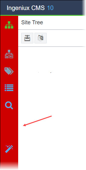
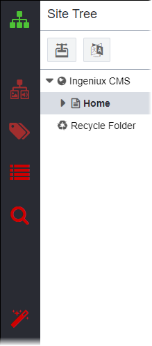
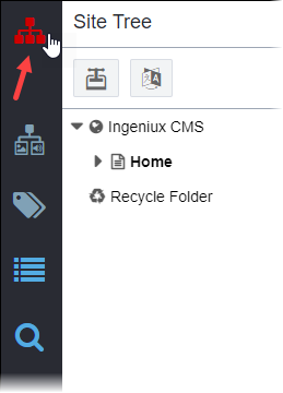
Background color of the utility bar

Utility Bar Background Color (P1)

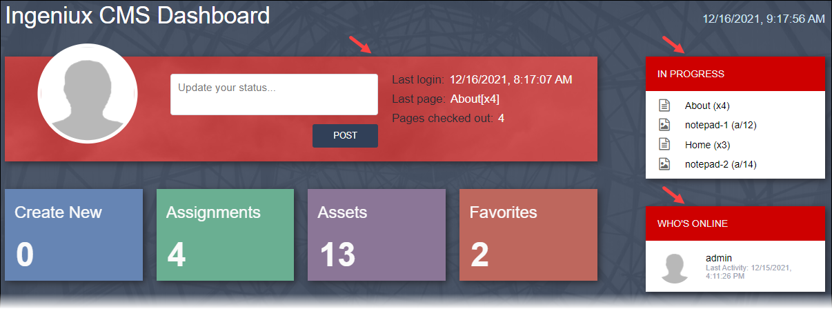
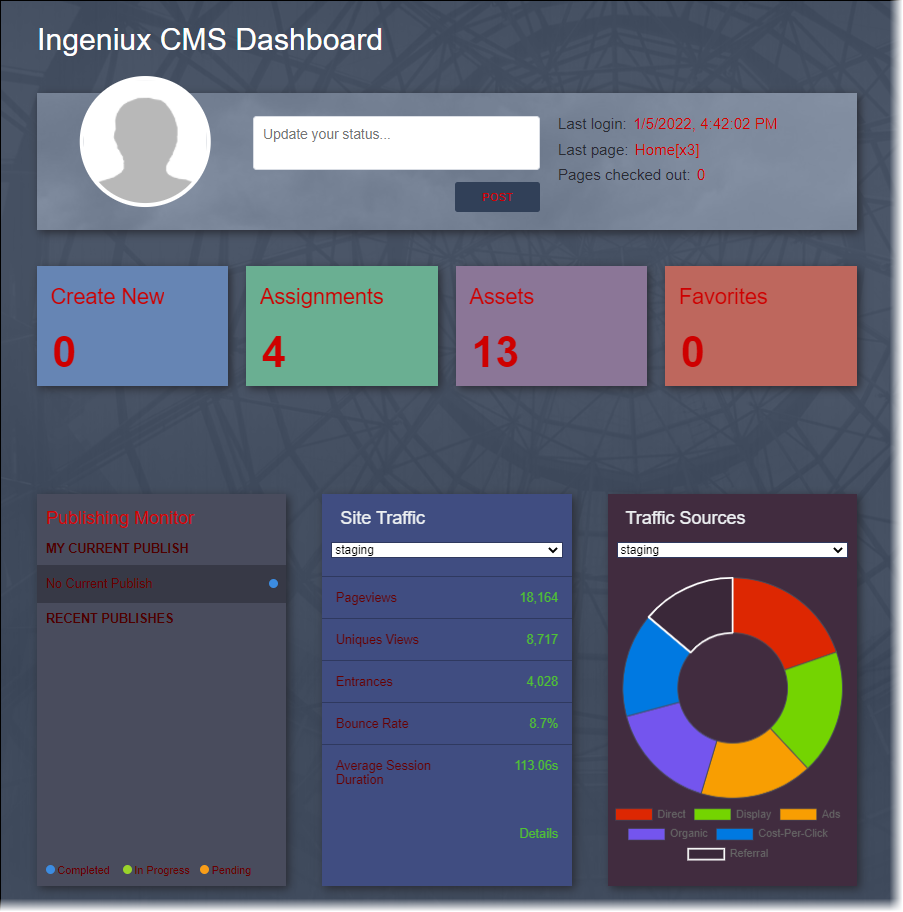
Dashboard UI objects:
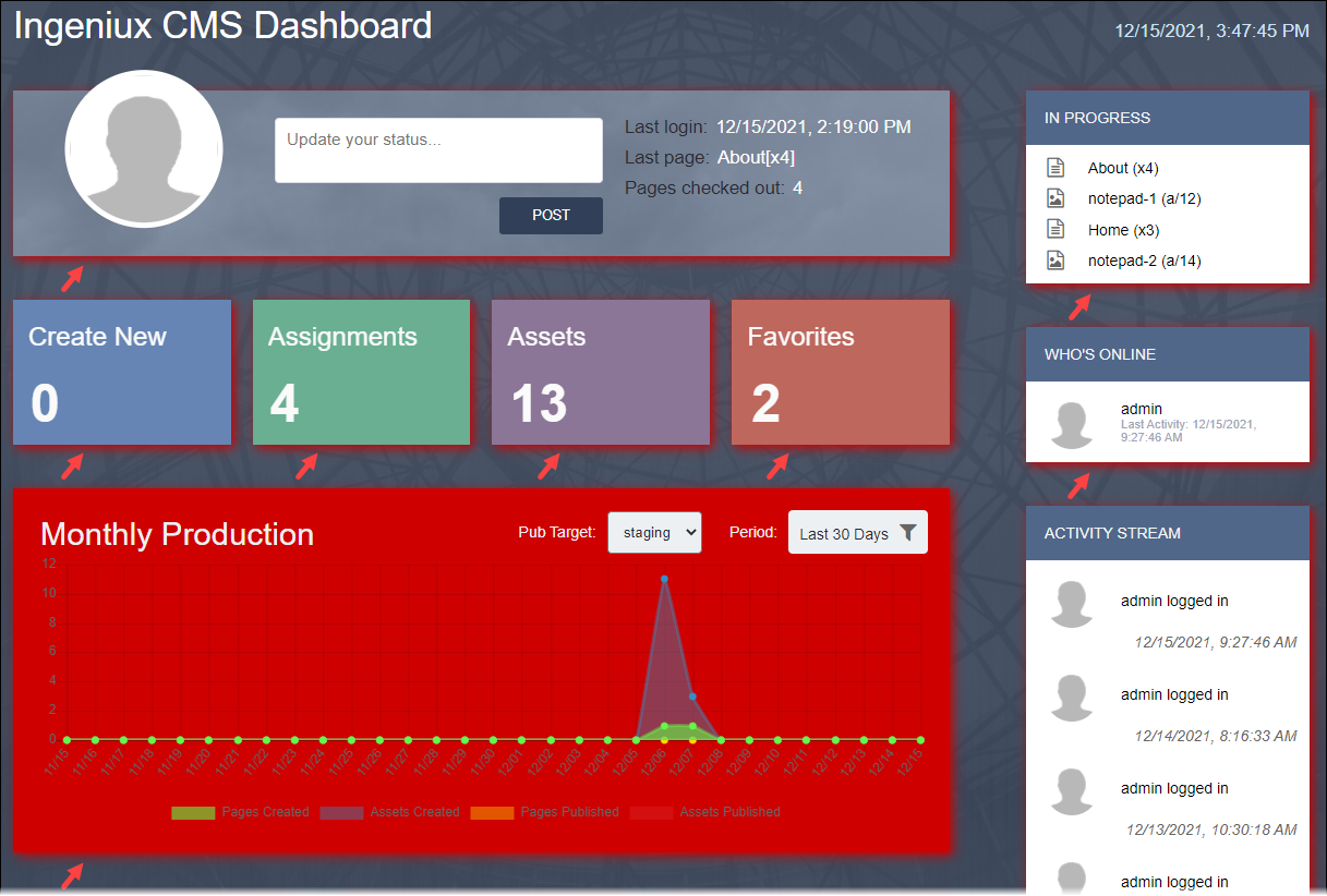
  • Shadow color of the box areas
  • Background color of theMonthly Production area

Drop Shadow on Boxes and Monthly Production Background in Dashboard
                    (P1)

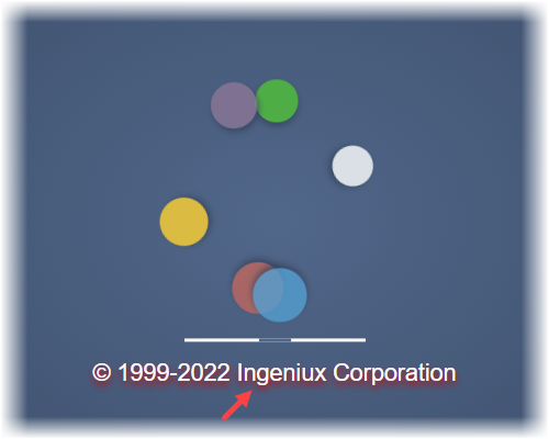
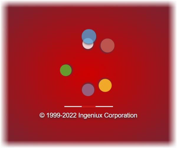
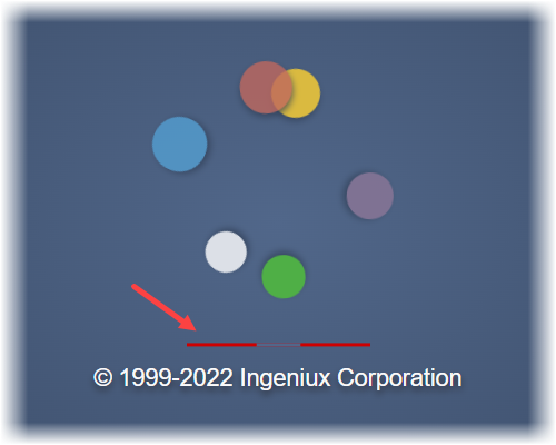
Drop shadow color of the loading screen text

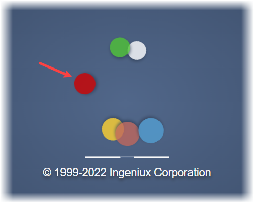
Loading Screen Text Shadow (P1)

Back to Top

P2

Ingeniux Default Color: #314058

UI ObjectsExample
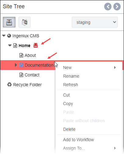
Background color of the navigation bar

Navigation Bar Background (P2)

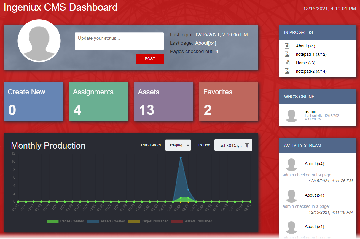
Dashboard UI objects:
  • Background color of Dashboard area
  • Fill color of the Post button in the Status area

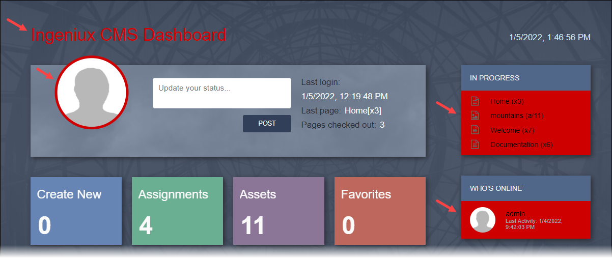
Dashboard Area Background and Status Post Button (P2)

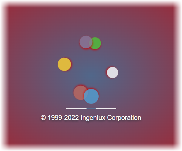
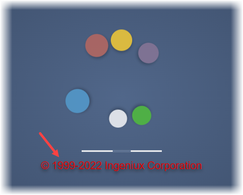
Loading screen UI objects:
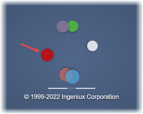
  • Outer gradient background color of the loading screen
  • Drop shadow color of the circle graphics

Outer Gradient of Loading Screen Background (P2)

Back to Top

P3

Ingeniux Default Color: #51678a

UI ObjectsExample
General UI objects:
  • Fill color of the non-selected main navigation buttons
  • Color of the ancillary navigation dividers
  • Color of the utility pane divider
  • Color of tool tip, clear, and loading spinner icons in Site page and component elements
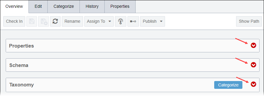
  • Color of the Asset Overview tab arrow icons
  • Fill color of active confirmation buttons (e.g., Create, OK) in dialogs
  • Box shadow color of dialogs

Navigation bar:

Main Navigation Button Fill (P3)

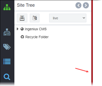
Utility pane divider:

Utility Bar Divider (P3)

Site main pane icons:

Site Icons (P3)

Assets main pane icons:

Assets Icons (P3)

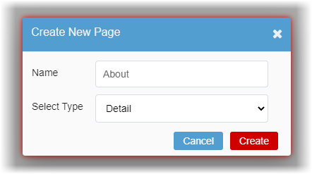
Dialog:

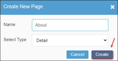
Dialog Confirmation Button Fill and Dialog Box Shadow (P3)

Dashboard UI objects:

  • Background color of the Status area
  • Background color of the header in the following areas:

    • In Progress
    • Who's Online
    • Activity Stream
    • CMS Statistics

Dashboard Status Background and Headings Background (P3)

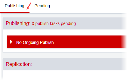
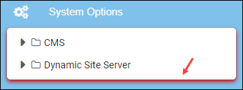
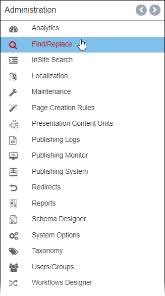
Administration UI objects:
  • Text color of headings and sub-headings
  • Bottom border color of tabs
  • Drop shadow color of sub-menus (e.g., Reports, System Options in the Administration menu)
Heading Text:

Administration Headings and Sub-headings (P3)

Tab Bottom Border:

Tab Bottom Border (P3)

Sub-menu box shadow:

Sub-menu Box Shadow (P3)

Inner gradient background color of the loading screen

Inner Gradient of Loading Screen Background (P3)

Back to Top

P4

Ingeniux Default Color: #6b7d98

UI ObjectExample
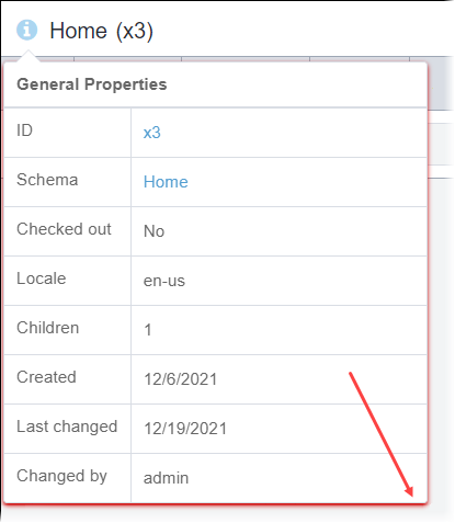
Drop shadow color of the General Properties dialog in the Site and Assets areas

General Properties Drop Shadow (P4)

Administration UI objects:
  • Box shadow color on toolbars and boxes
  • Text color of headings within boxes

Box Shadow and Inner Box Headings (P4)

Back to Top

P5

Ingeniux Default Color: #9da6b4

UI ObjectExample
General UI objects:
  • Color of the utility pane icon buttons
  • Border color of the utility pane fields and buttons (on hover and on click only)
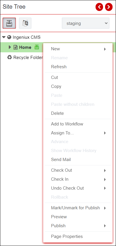
  • Drop shadow color of the utility pane context menu
  • Color of the main pane borders and schema field element numbers in the Site and Assets areas
  • Box shadow of the main pane toolbar buttons (on hover and on click only)
  • Drop shadow color of buttons (on hover only) in dialogs

Utility pane:

Utility Pane Icons, Borders, and Context Menu Drop Shadow (P5)

Main pane:

Main Pane Borders (P5)

Dialog:

Dialog Button Drop Shadow (P5)

Dashboard UI objects:
  • Color of the time stamp text in the Who's Online area
  • Color of the action log text in the Activity Stream area

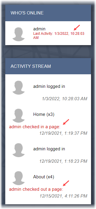
Who's Online and Activity Stream Log Text in Dashboard (P5)

Administration UI objects:
  • Border color of inner boxes
  • Drop shadow of inner boxes
  • Drop shadow color of buttons (on hover only)

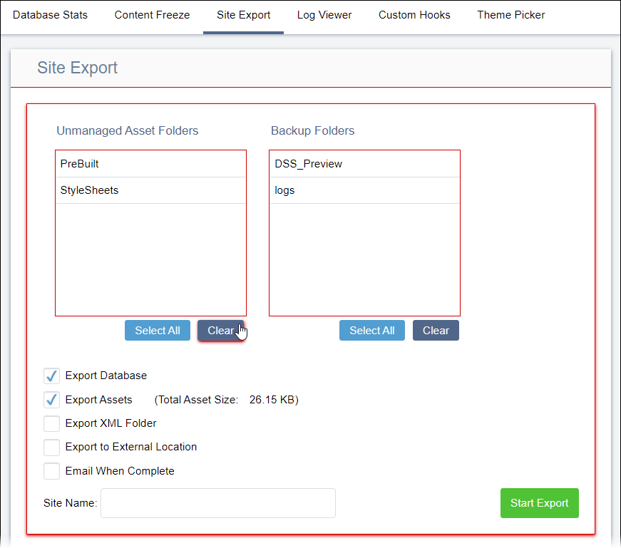
Box Borders and Button Drop Shadow in Administration (P5)

Back to Top

P6

Ingeniux Default Color: #d9dde4

UI ObjectExample
General UI objects:
  • Fill color of selected toggle buttons and content items in utility trees (on click only)
    Note
    The CMS applies the A3 color (#4fc236) when users right-click on a content item in utility trees.
  • Border color of utility pane and main pane non-selected buttons
  • Color of inactive menu options and main pane buttons
  • Background color of read-only utility trees
  • Fill color of non-selected main pane tabs in Site and Assets
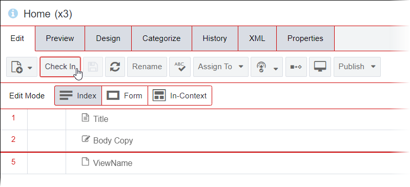
  • Fill color of selected main pane Edit Mode buttons
  • Fill color of inactive buttons in dialogs
  • Border color of fields in dialogs

Utility pane:

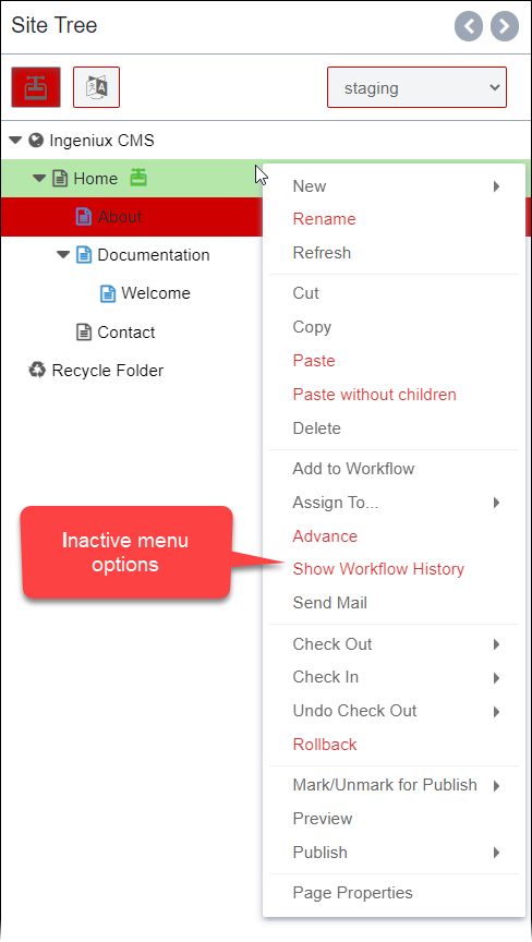
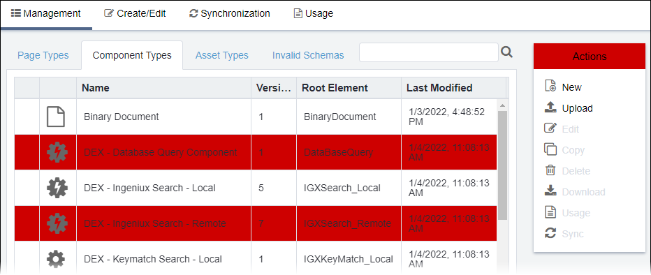
Selected Toggle Buttons and Content Items in Utility Trees and Inactive Menu
                    Options in Utility Tree Context Menus (P6)

Read-only Utility pane:

Read-only Utility Pane Background (P6)

Main pane:

Non-selected Main Pane Tabs and Selected Edit Mode Button (P6)

Dialog:

Dialog Field Borders and Inactive Buttons (P6)

Back to Top

P7

Ingeniux Default Color: #edf0f2

UI ObjectExample
General UI objects:
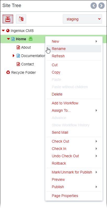
  • Fill color of options (on hover only) for standard menus, context menus, and drop-down menus
  • Color of menu dividers
  • Fill color of header cells in tables
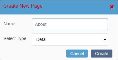
  • Color of heading text and close (x) buttons in dialogs

Menu:

Moused-over Option and Dividers in Context Menu (P7)

Table:

Table Header Cells (P7)

Dialog:

Dialog Heading Text and Close Button (P7)

Dashboard UI objects:
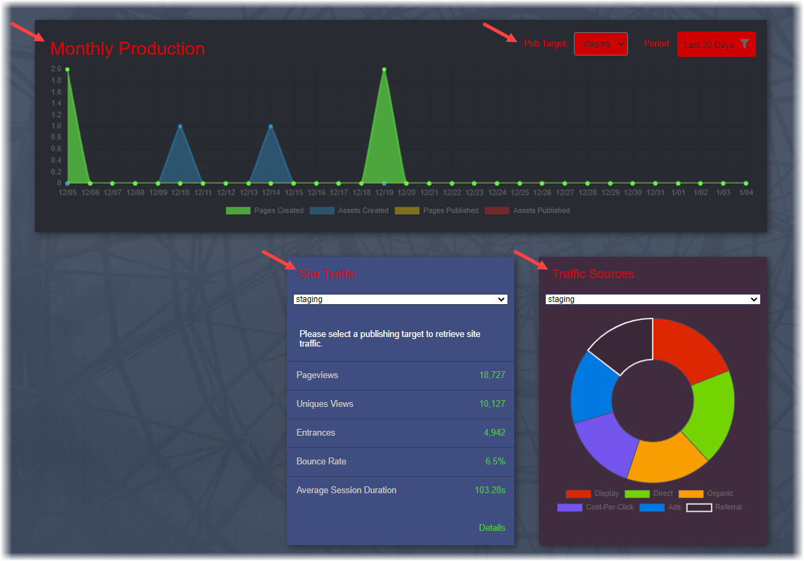
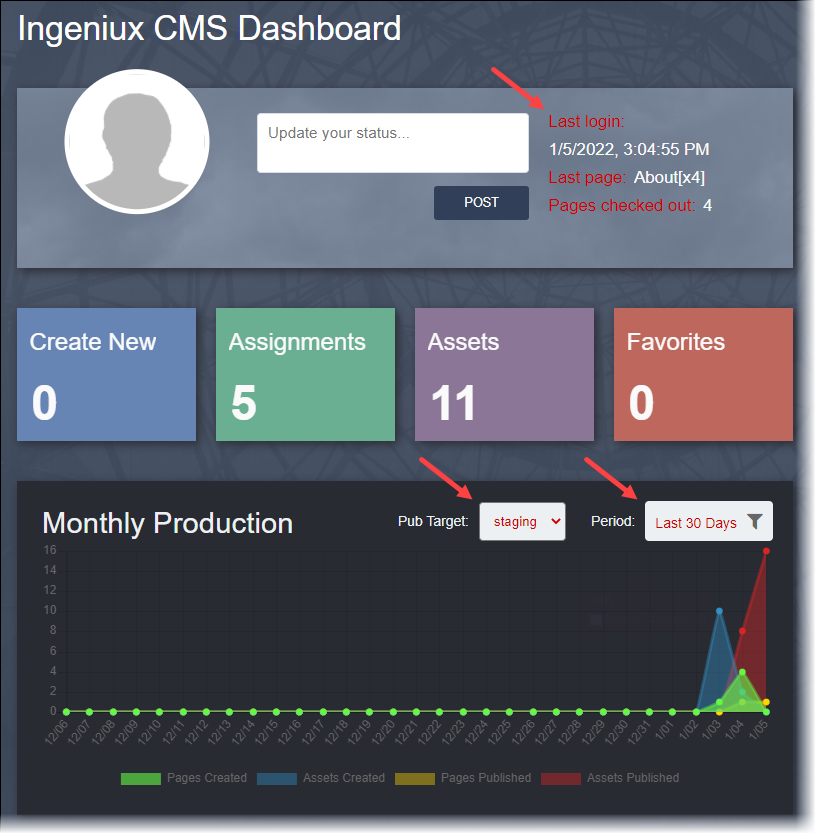
  • Text color of headings in the Monthly Production, Site Traffic, and Traffic Sources areas
  • Fill color of the drop-down Pub Target and Period fields in the Monthly Production area

Monthly Production Heading and Fields, Site Traffic Heading, and Traffic
                    Sources in Dashboard (P7)

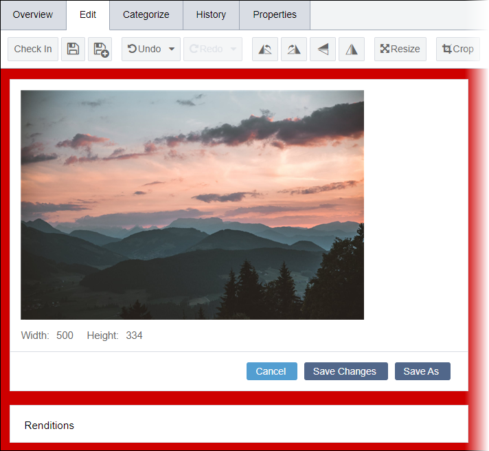
Background color of the editor area in Assets Edit tab

Assets Edit Tab Background (P7)

Administration UI objects:
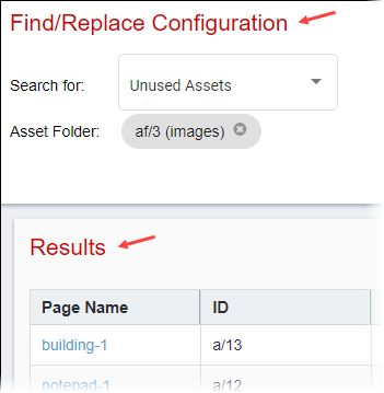
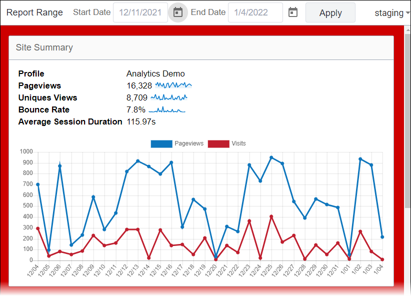
  • Background color of Analytics
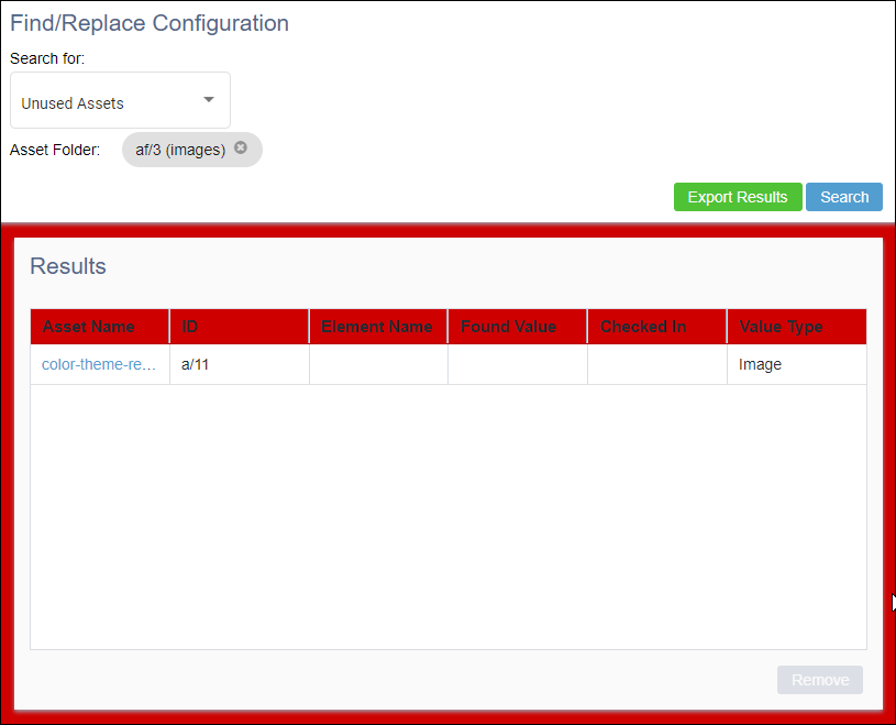
  • Outer box background color of the Results area in Find/Replace
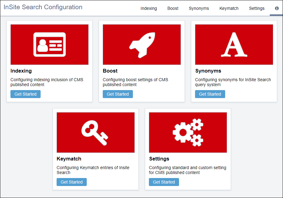
  • Background color of thumbnail graphics in InSite Search

Analytics:

Analytics Background (P7)

Find/Replace:

Find/Replace Results Area Background (P7)

InSite Search:

InSite Search Thumbnail Graphics (P7)

Back to Top

P8

Ingeniux Default Color: #f2f4f5

UI ObjectExample
General UI objects:

  • Fill color of buttons and drop-down fields in the utility pane and main pane
  • Background color of the main pane in the Site, Assets, and Administration areas
  • Left gradient background color of field names in the Site Edit tab
  • Fill color of table rows (on hover only)
  • Fill color of selected the menu option (on click only) in the Properties dialog

Utility pane:

Utility Pane Toggle Button and Field Background (P8)

Main pane:

Main Pane Buttons, Field Elements, and Area Background (P8)

Table (this example is located in Administration > Schema Designer):

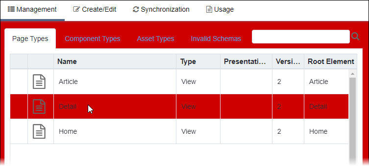
Moused-over Table Rows (P8)

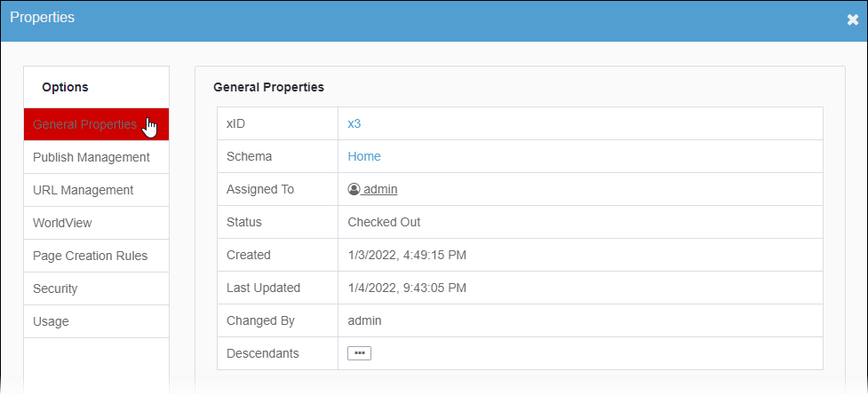
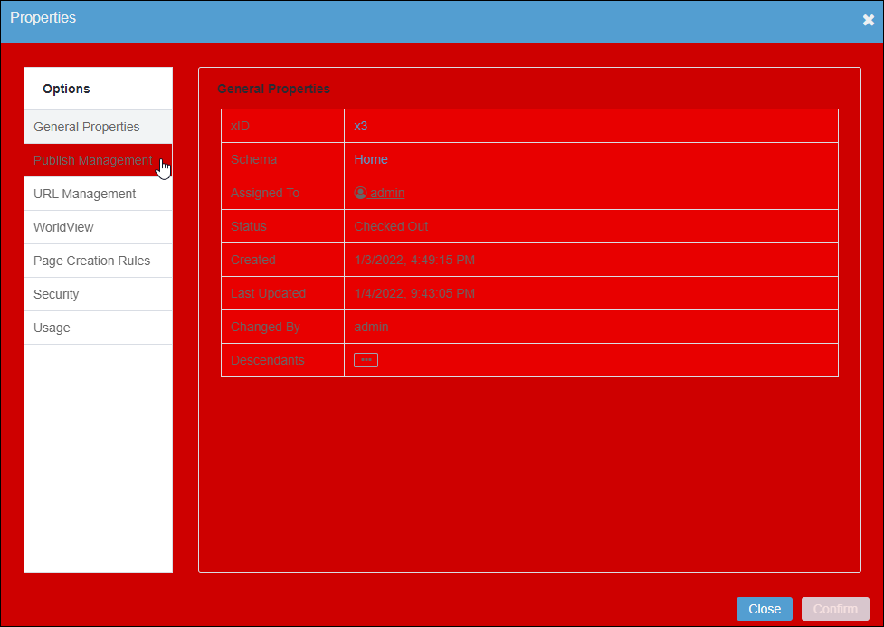
Properties dialog:

Selected Menu Options in Properties Dialog (P8)

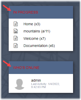
Text heading color in the In Progress, Who's Online, Activity Stream, and CMS Statistics areas of the Dashboard

In Progress and Who's Online Headings (P8)

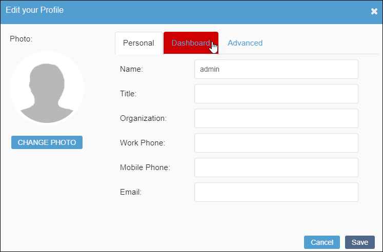
Fill color of tabs (on hover only) in the Edit your Profile dialog

Moused-over Edit Your Profile Dialog Tabs (P8)

Back to Top

P9

Ingeniux Default Color: #fafafa

UI ObjectExample
General UI objects:

  • Right gradient background color of field names in the Site Edit tab
  • Background color of dialogs
  • Fill color of every other non-selected row in tables
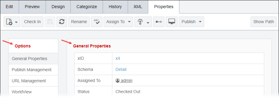
  • Fill color of menu options (on hover only) and background color of properties areas in the Properties dialog
  • Background color of properties areas in Properties tab
  • Background color of headers for settings in the Assets Overview tab

Edit tab in Site main pane:

Main Pane Edit Tab Element Fields (P9)

Dialog:

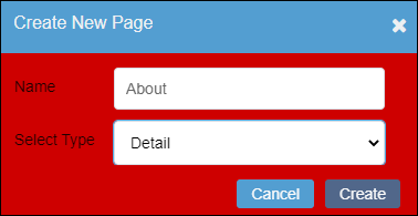
Dialog Background (P9)

Table (this exampe is in Administration > Schema Designer):

Every other Non-Selected Table Row (P9)

Properties dialog:

Background and Moused-over Menu Options in Properties Dialog (P9)

Properties tab:

Properties Tab Background (P9)

Overview tab in the Assets Manager:

Assets Overview Tab Header Backgrounds (P9)

Administration UI objects:
  • Background color of header areas
  • Inner box background color of the Results area in Find/Replace

Header area:

Administration Header Background (P9)

Find/Replace Results area:

Administration Inner Box Background (P9)

Fill color of the load bar in the loading screen

Loading Screen Bar (P9)

Back to Top

P10

Ingeniux Default Color: #ffffff

UI ObjectExample
General UI objects:
  • Text color of the Ingeniux CMS title in the top left corner of the UI
  • Main navigation button text (on hover and on click only)
  • Ancillary navigation icon and drop-down menu color
  • Background color of standard menus, context menus, and drop-down menus
  • Background color of the utility pane, the utility pane and the main pane

Ingeniux CMS Title and main navigation:

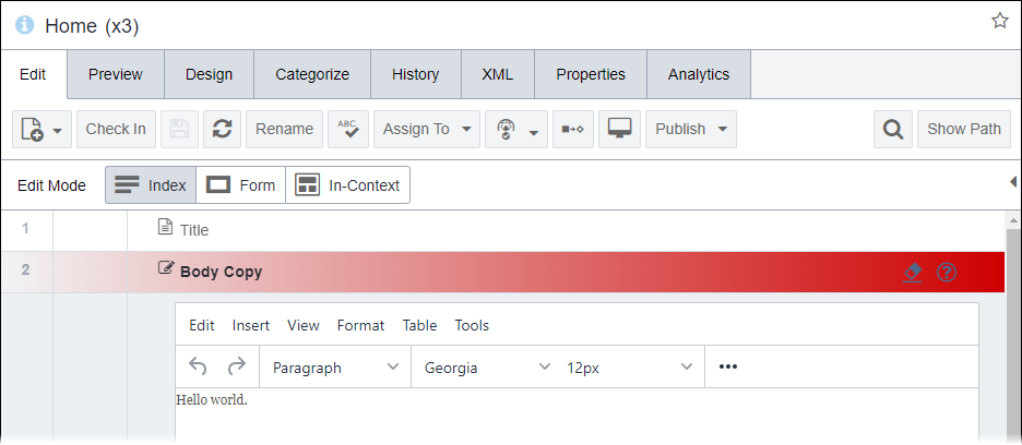
Ingeniux CMS 10 UI Title and Main Navigation Button Text (P10)

Ancillary navigation:

Ancillary Navigation Icons and Drop-down Menu (P10)

Utility pane:

Utility Pane and Context Menu Background (P10)

Main pane:

Main Pane Background (P10)

Dashboard UI objects:
  • Text color of the Ingeniux CMS Dashboard title
  • Border color of the user profile image in the Status area
  • Background color of the In Progress, Who's Online, Activity Stream, and CMS Statistics areas

Ingeniux CMS Dashboard Title, In Progress Background, and Who's Online
                    Background (P10)

Fill color of a single circle graphic in the loading screen

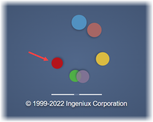
Loading Screen Circle Graphic (P10)

Back to Top

T (Text)

T1

Ingeniux Default Color: #292b33

UI ObjectExample
General UI objects:
  • Text color of utility pane headings
  • Fill color of the utility pane toggle button graphics (on hover only)
  • Text color of selected nodes (on click only) in utility trees
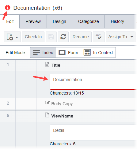
  • Text color of content item titles and selected element field titles in the Site andAssets areas
  • Text color of the toolbar buttons (on hover only) in the Site andAssets
  • Text color of Edit Mode buttons in the Site main pane
  • Text color of headings in the Properties tab and dialog
  • Color of cell text and headings in tables

Utility pane:

Utility Pane Heading, Moused-over Toggle Buttons, and Selected Content Items
                    (T1)

Main pane:

Main Pane Content Item Title, Toolbar Button Text, and Selected Element Field
                    Titles (T1)

Properties tab:

Properties Tab Headings (T1)

Table:

Table Headings and Cell Text (T1)

Dashboard UI objects:
  • Text color of field titles in the Status area
  • Text color of the drop-down field values in theMonthly Production area

Status Field Titles and Monthly Production Drop-down Field Text (T1)

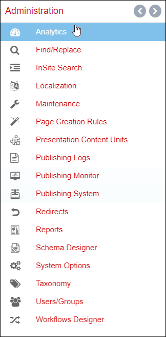
Text color of the non-selected Administration menu options

Non-selected Administration Menu Option Text (T1)

Back to Top

T2

Ingeniux Default Color: #666666

UI ObjectExample
General UI objects:
  • Color of node icons and general icons in the utility pane
  • Icon color of checked-in content items in utility trees
  • Text color of active context menu options in utility trees
  • Color of icons, toolbar button text, and standard text in the main pane

Utility pane:

Utility Pane Icons, Checked-in Content Item Icons, and Active Context Menu
                    Buttons (T2)

Main pane:

Icons, Toolbar Buttons, and Main Pane Text (T2)

Dashboard UI objects:
  • Color of icon graphics in the In Progress and Monthly Production areas
  • Text color of time stamps in the Activity Stream area

In Progress Content Item Icons and Activity Stream Time Stamps in Dashboard
                    (T2)

Icon color of non-selected options in the Administration menu and Apps menu

Non-selected Administration Menu Option Icons (T2)

Back to Top

T3

Ingeniux Default Color: #666666

UI ObjectExample
General UI objects:
  • Text color of non-selected buttons in the main navigation
  • Text color of the username in the ancillary navigation
  • Text color of buttons dialogs

Main navigation and ancillary navigation:

Non-selected Main Navigation Button Text (T3)

Dialog:

Dialog Button Text (T3)

Dashboard UI objects:
  • Text color of the Post button and field values in the Status area
  • Text color of the quick content widgets
  • Text color of the Publishing Monitor and Site Traffic areas

Status Post Button and Field Value Text, Quick Widget Text, Publishing
                    Monitor Text, and Site Traffic Field Title Text (T3)

Icon and text color of the selected option (on click only) in the Administration menu

Selected Administration Menu Option Text (T3)

Color of text in the loading screen

Loading Screen Text (T3)

Back to Top

(A) Accent

A1

Ingeniux Default Color: #539ed1

UI ObjectExample
General UI objects:
  • Icon color of checked-out content items in the Site Tree and Assets Tree
  • Color of checks in checkbox fields
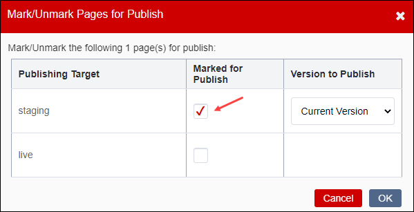
  • Background color of headers and cancel/close buttons in dialogs
  • Fill color of main pane loading spinner

Utility pane:

Icons of Checked-out Site Tree Content Items (A1)

Dialog with checkbox field:

Dialog Checkboxes and Header Background (A1)

Loading spinner:

Main Pane Loading Spinner (A1)

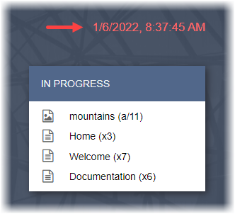
Text color of current date and time stamp in the Dashboard

Dashboard Current Date and Time Stamp (A1)

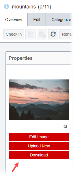
Fill color of edit buttons in the Assets Overview tab

Assets Overview Tab Edit Buttons (A1)

Administration UI objects:
  • Fill color of action buttons
  • Border color of fields (on hover and on click only)
  • Text color of non-selected tabs

Action buttons and fields:

Administration Action Buttons, Field Borders, and Checkboxes (A1)

Tabs:

Non-selected Administration Tabs (A1)

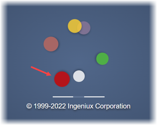
Fill color of a single circle graphic in the loading screen

Loading Screen Circle Graphic (A1)

Back to Top

A2

Ingeniux Default Color: #53ace3

UI ObjectExample
General UI objects:
  • Text color of 10 in the Ingeniux CMS 10 UI title
  • Fill color of the selected button in the main navigation (on hover and on click only)
  • Icon color of non-selected options in the Utility bar
  • Color of General Properties icon
  • Border color of selected text fields and non-toolbar buttons (on click only) in the main pane

Ingeniux CMS Title and main navigation:

Ingeniux CMS 10 UI Title and Selected Main Navigation Button (A2)

Utiltiy bar:

Utility Bar Icons (A2)

General properties icon and selected text field:

General Properties Icon and Selected Text Field Border (A2)

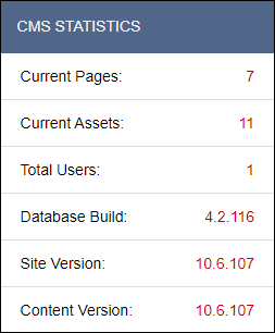
Color of CMS Statistics field values in the Dashboard

CMS Statistics Field Values in Dashboard (A2)

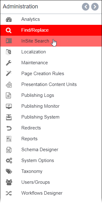
Fill color of selected options (on hover and on click only) in the Administration menu

Selected Administration Menu Options (A2)

Back to Top

A3

Ingeniux Default Color: #4fc236

UI ObjectExample
General UI objects:
  • Color of the navigation bar divider
  • Icon color of the selected option (on click only) in the utility bar
  • Fill color of toggle icons in utility trees
  • Fill color selected content items (on right-click only) in utility trees

Navigation bar divider:

Navigation Bar Divider (A3)

Utility bar:

Selected Utility Bar Icon (A3)

Utility tree pane:

Utility Tree Selected Content Items on Right-click and Toggle Icons
                    (A3)

Fill color of a single circle graphic in the loading screen

Loading Screen Circle Graphic (A3)

Back to Top

A4

Ingeniux Default Color: #fed130

UI ObjectExample
Fill color of the following message in the Site Edit tab for checked-in content items:
This page must be checked out before you can edit it!

This Page Must be Checked Out Before You Can Edit It Fill (A4)

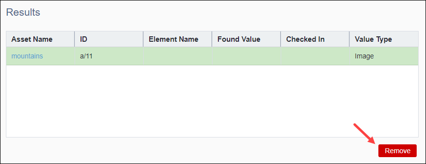
Fill color of the Remove button in Administration > Find/Replace

Find/Replace Remove Button in Administration (A4)

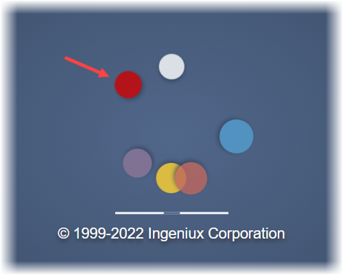
Fill color of a single circle graphic in the in loading screen

Loading Screen Circle Graphic (A4)

Back to Top

A5

Ingeniux Default Color: #cf2424

UI ObjectExample
General UI objects:
  • Color of required text for fields
  • Border and fill color of error messages
  • Fill color of the Dismiss button in error messages

Required text for fields:

Required Text for Fields (A5)

Error message:

Error Message (A5)

Back to Top

D (Dashboard)

D1

Ingeniux Default Color: #6685b4

UI ObjectExample
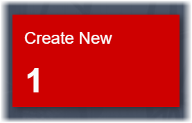
Fill color of the Create New widget in the Dashboard

Create New Widget in Dashboard (D1)

Back to Top

D2

Ingeniux Default Color: #6aaf92

UI ObjectExample
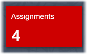
Fill color of the Assignments widget in the Dashboard

Assignments Widget in Dashboard (D2)

Back to Top

D3

Ingeniux Default Color: #8b7697

UI ObjectExample
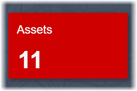
Fill color of the Assets widget in the Dashboard

Assets Widget in Dashboard (D3)

Fill color of a single circle graphic in loading screen

Loading Screen Circle Graphic (D3)

Back to Top

D4

Ingeniux Default Color: #8b7697

UI ObjectExample
Fill color of the Favorites widget in the Dashboard

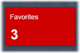
Favorites Widget in Dashboard (D4)

Fill color of a single circle graphic in the loading screen

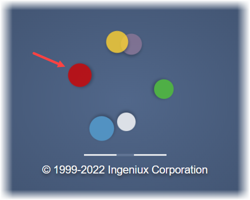
Loading Screen Circle Graphic (D4)

Back to Top

D5

Ingeniux Default Color: #494c5d

UI ObjectExample
Background color of the Publishing Monitor area in the Dashboard

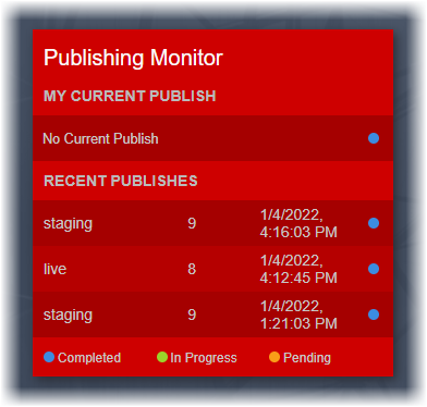
Publishing Monitor Background (D5)

Back to Top

D6

Ingeniux Default Color: #404d81

UI ObjectExample
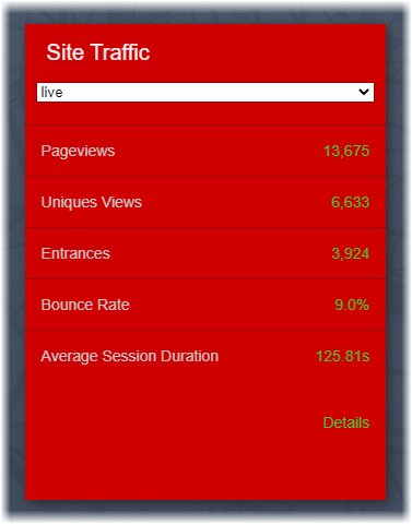
Background color of the Site Traffic area in the Dashboard

Site Traffic Background (D6)

Back to Top

D7

Ingeniux Default Color: #412c3f

UI ObjectExample
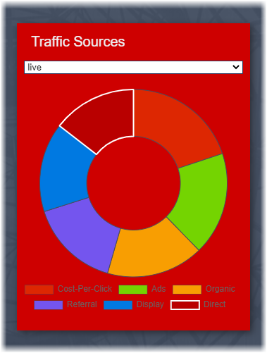
Background color of the Traffic Sources area in the Dashboard

Traffic Sources in Dashboard (D7)

Back to Top

I (ICE)

I1

Ingeniux Default Color: #cae7fc

UI ObjectExample
Background color of empty components set to render within in-context-editing (ICE) mode

Empty Component Rendered in ICE (I1)

Back to Top