Validating User Input in Visual Form Builder
When creating a form, it's important to include ways to make sure that users submit useful, properly formatted input. Typically, this requires fluency in one or more scripting languages, but in Visual Form Builder, content creators can configure form validation through a series of prebuilt components.
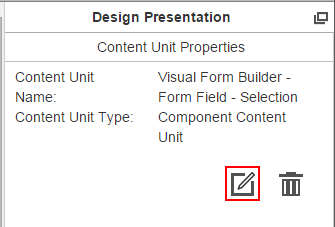
To validate a form field in Visual Form Builder, open the presentation the contains the form and click a form field to select it. Then, on the Design Presentation pane, click the Edit Content Unit icon.

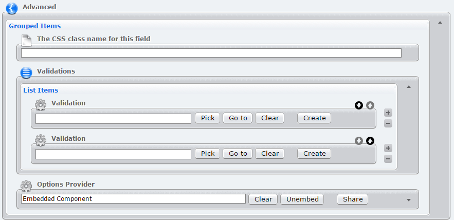
Expand the Advanced section on the editor, then expand Validations section. This section contains a group of component elements. Click Create to select a validation component.

The following is a list of all validation components and their configuration options. These components are based on JQuery validation methods. In the Error Message field for each validation component, enter the message that users should receive when their input doesn't meet the validation requirements. ("Valid email address required" when requesting an email, etc.) The type of components available vary by form field; a radio button field, for example, can't include components that validate text input.
Required
Validates that the form field has been completed. This validation component can be used on any form field.
URL
Validates that the form field contains a properly formatted URL.
Number
Validates that the form field contains a number (can include decimals).
Email Address
Validates that the form field contains a properly formatted email address.
Digits
Validates that the form contains an integer.;
Date
Validates that the form contains a date. (Several formats are valid; read the documentation on the JQuery method for more information.)
Credit Card
Validates that the form contains a credit card number. This method only validates that the credit number is formatted correctly. Checking the validity of the credit card itself must be performed server side.
Length Range
Validates that a form field contains a value within a predetermined range of characters or selections. This validation component works with text fields, selects, and check boxes.
Minimum Length: The minimum number of characters or selections. If left blank, there is no minimum length
Error Message: Minimum Length Label: The message that displays when an input doesn't meet the minimum length (Default: "Minimum Length:").
Maximum Length: The maximum number of characters or selections. If left blank, there is no maximum length.
Error Message: Maximum Length Label: The message that displays when an input exceeds the maximum length. (Default: "Maximum Length:")
Error Message: The general error message that displays when an input is outside the desired range.
Range
Validates that the form contains a numerical value within a given range.
Minimum Length: The minimum number of characters or selections. If left blank, there is no minimum length
Error Message: Minimum Label: The message that displays when an input doesn't meet the minimum length (Default: "Minimum:").
Maximum Length: The maximum number of characters or selections. If left blank, there is no maximum length.
Error Message: Maximum Label: The message that displays when an input exceeds the maximum length. (Default: "Maximum:")
Error Message: The general error message that displays when an input is outside the desired range.
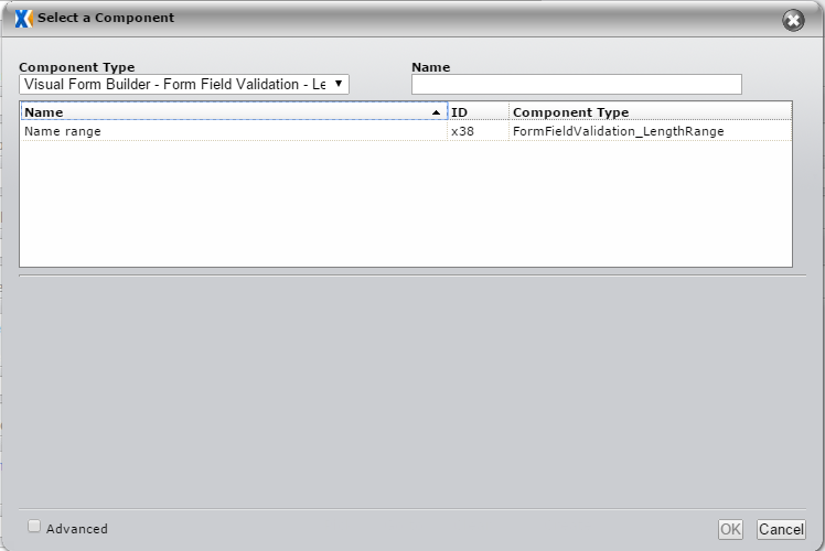
After creating and completing the validation component, you can click the + and - buttons to create more. When you're finished creating components, click Apply Changes. After a component has been created once, it can be reused by clicking Pick, selecting it from a list, and clicking OK.

