CMS 10.6 Visual Form Builder Content Units
Visual Form Builder provides built-in content units for form creation. Use these content units to create different types of fields within forms. Once set up and published, end users can complete and submit these forms via the DSS.
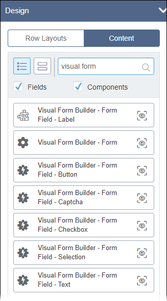
Navigate to the Content section within the Design pane in Page Builder to access these Visual Form Builder content units. See CMS 10.6 Adding Child Layouts to Forms for details to add Visual Form Builder content units to existing forms within Page Builder presentations.

Visual Form Builder Fields
Excluding the Visual Form Builder - Form top-level form content unit, Visual Form Builder provides six content units for creating forms fields. See the types below for details about each content unit and correlating field elements.
- Label (field unit)
- Button (component unit)
- Captcha (component unit)
- Checkbox (component unit)
- Selection (component unit)
- Text (component unit)
Visual Form Builder - Form Field - Label (Field Unit)
A field label used to identify other form fields for end users. Enter text to serve as the label. This field provides no other configuration options.
Visual Form Builder - Form Field - Button (Component Unit)
A form button used by end users to either submit or reset a form.
Field elements include:
- Field Name
- Enter the form button name.
- Button Type
- Determine the action the button executes by selecting one of the following drop-down
list options:
- Button
- Serves as a standard form button.
- Reset
- Resets the form and clears end user input from fields.
- Submit
- Submits all end user form input to the system.
- Button Label
Enter the name that displays as the button label to end users.
Visual Form Builder - Form Field - Captcha (Component Unit)
A form field for a CAPTCHA. This field setup requires a reCAPTCHA account.
Field elements include:
- Captcha Key
- Enter the site domain's global key, generated by your reCAPTCHA account.
- Recaptcha Id
- Enter the reCAPTCHA widget's ID.
Visual Form Builder - Form Field - Checkbox (Component Unit)
A form checkbox used by end users to select or clear an option.
Field elements include:
- Field Name
- Enter the form checkbox name.
- Checkbox Label (optional)
- Enter the name that displays as the checkbox label to end users.
- Checked By Default (optional)
- Select or clear the Click to enable checkbox. When Click to enable is selected, the system selects the checkbox form field by default for end users.
Visual Form Builder - Form Field - Selection (Component Unit)
A form field used by end users to select an option from a predefined list.
Field elements include:
- Field Name
- Enter the selection form field name.
- Selection Input Type
- Choose the selector type. Options include:
- select
- Allows end users to select only one option from a drop-down list.
- radio
- Allows end users to select only one option from radio buttons.
- multi-select
- Allows users to select multiple options from a menu.
- Field Value (optional)
- Enter the selection field text value.
You can expand Advanced to populate the selection form field with options. The system adds options as a list of embedded components.
Visual Form Builder - Form Field - Text (Component Unit)
A text form field where end users enter text input.
Field elements include:
- Field Name
- Enter the text form field name.
- Text Input Type
- Select the text input type via the Select One drop-down list.
Options include:
- text
- Provides a simple text field suitable for shorter end user input.
- textarea
- Provides a large text field suitable for longer end user input.
- password
- Provides a text field for end user password input.
Advanced Form Field Options
Each form field component content unit (except for Visual Form Builder - Form Field - Captcha) includes optional Advanced settings. Expand field elements under Advanced to configure the following options:
- The CSS class name for this field
- Enter a custom CSS class to style the form field.
- Validations
- Use the following nested field element to implement requirements for user input validation.
- Validation
- Insert components that validate user input. See CMS 10.6 Validating User Input in Visual Form Builder for
details.NoteOnly the following form fields provide validation settings:
- Visual Form Builder - Form Field - Checkbox
- Visual Form Builder - Form Field - Selection
- Visual Form Builder - Form Field - Text
- Options Provider
- This setting is only available for Visual Form Builder - Form Field -
Selection. Use the nested Fields List to configure
choice components that will serve as available options for users to choose
from. Select Add New to add new component choices to the
list.
Configure the following fields for each choice component:
- Value
- Enter the value for the choice component entry.
- Label
- Enter the label that will display to users for the choice component entry.
